All of us probably remember boring world maps from school, colored in according to the concentration of oil, gas, other natural resources, the politics of the country or other uninteresting details.
These maps, however, tell you everything that you always wanted to know, but were afraid to ask.
The average age of losing virginity by country, ranging from 15 years (dark red), the earliest, to 23 (dark green), the oldest.
The youngest on the list is Iceland, and Malaysia apparently hang on the longest.
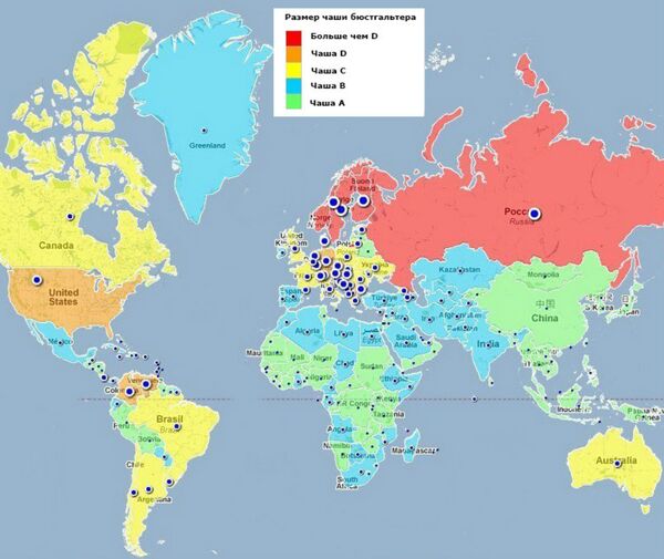
World map of average breast cup size in the world, where the red stands for “over D” – the largest, and green – for A, the smallest. The blue dots stand for cup size from 1 (the smallest) to 5 (the largest).
If you have ever wondered which pants are packing the biggest punch around the world, then the comprehensive list of average penis size by country is worth checking out. It shows that South America takes the bragging rights, leaving China, India and other Asian countries far behind.
The spread of McDonald’s around is simple to understand: red shows the countries which have it, blue shows that that don't.
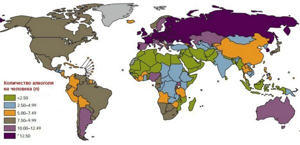
The map of alcohol consumption around the world puts Russia and other European countries in the lead. Unsurprisingly, countries in the Middle East and northern Africa drink the least.
A map which reveals the world's most frantic coffee-drinkers surprisingly locates the global epicenter, far from tropical the coffee plantations, in Scandinavia.
This map of the world shows the preferred alcoholic beverages of each country — each country’s most widely consumed drink, where orange stands for beer, dark rose for wine, blue for spirits, dark green for other alcoholic drinks, green means consumption is less than 0,1 liter and light yellow means that there is no data for the area.
The map of happiness has Finland wagging its figurative tail the hardest.
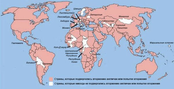
The map of British invasions shows white for where they have never been. As it turns, despite being known as gentlemen, the British have in fact invaded almost 90 per cent of the countries around the globe. Bad manners indeed!
And this one is the world obesity map, with red showing countries with the highest proportion of people classified as obese and yellow having the lowest proportion.
Finally – The Upsidedown Map — how would it look like if the North was at the bottom. This is probably how the Australians view themselves.
It's all a matter of perspective at the end of the day.


